Mercy Ships
Mercy Ships
Website Design and DevelopmentFeatures
- Fully responsive / mobile-friendly
- 20+ unique templates, with re-usable sections
- Easy to manage WP backend
My Role
- UI Design (Sitemap, UX / Wireframes, Layout)
- Art Direction
- Development (Wordpress)
Completed 2014
The Challenge
Mercy Ships’ existing website had a good look and feel, but the layout was confusing and there wasn’t a ton of thought put into the UX. The client was also having trouble maintaining the site and needed a backend overhaul.
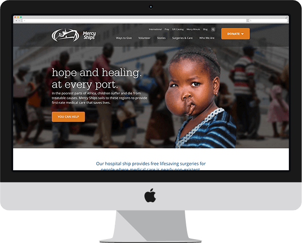
About Mercy Ships
Mercy Ships is a nonprofit organization with a hospital ship that travels to countries where medical care is nearly non-existent to provide free lifesaving surgeries.
The first step of the project was thinking through the goals / scope of the site and balancing that with the different types of users we expected to visit the site.
Close-up of sitemap.
After a pretty extensive content-scraping and discovery session, I sat down with our talented content strategist and together we hammered out the sitemap.
High-fidelity wireframes.
The client was impressed with the new overall layout and reorganization of the site. So we moved on to roughly sketch out about 20 unique wireframes for the various sections. I recreated the sketches in InDesign as high-fidelity wireframes and then added a bit of interactivity to simulate click-throughs, drop-downs and other key interactions. All of the wireframes were done with the Bootstrap 3 framework in mind for quick development.Information Architecture
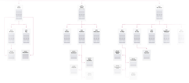
Sitemap
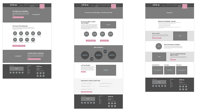
Wireframes
After we got our wireframes approved, we moved into the design phase. I was responsible for many of the specific page layouts, the responsive design, and overall art direction. We didn’t want to completely alienate users who were already familiar with the Mercy Ships brand, so we kept several elements of their old site’s design and focused on refining and freshening up the look. The result is a site that feels both big, bold and modern; while maintaining its own unique, friendly personality. We were given a lot of really great content to work with—stories, photos, videos, program details—you name it. So our biggest job was to sort out the content and think through what people would like to see, where they’d expect to find it, and what we wanted them to do after they interacted with it. Since Mercy Ships is a nonprofit, one of the primary goals of the site was to generate new and more-frequent donors. So throughout the site we made sure that the storytelling aspect was prominent and compelling. At the end of every piece of content, the user has a chance to donate, read another story, or learn more about Mercy Ships. After establishing the initial look and UX guidelines, I created a style guide to help our team maintain a consistent style across the entire site. Since we had so many different types of content and unique layouts, it was crucial that the styles across every page of the site didn’t contradict the established hierarchy.
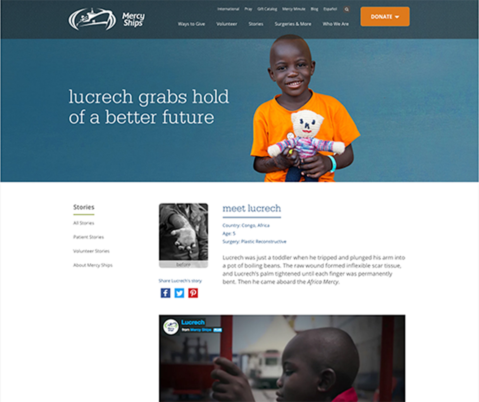
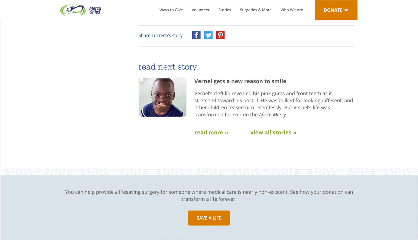
Story page for Lucrech. Top of page gives a quick synopsis of his story, along with before/after pictures and a chance to share.
Near the bottom of the page, we present the user with a call-to-action, along with the chance to share Lucrech's story or read another.
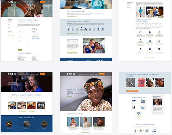
A few other layouts across different sections of the site.
Visual Design
Look and Feel
User Experience
Style Guide
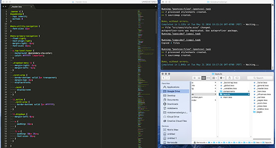
Once the designs were finalized, we sent along comps to the development team. I included a few coded snippets so they understood how we intended particular sections to adapt and re-flow across different devices. After a few hiccups during the development phase, we decided to bring the remainder of the project (about 40% left) in-house. I was responsible for coding the remaining templates, features, custom fields, etc. The site was built with Roots as a base theme and Bootstrap 3 as the framework. Grunt for concatenation / minification and LESS for CSS preprocessing. Git for version control and Virtualbox for testing. I spent some time with our (fantastic!) producers making sure the backend was easy and simple to use. We knew that such a big site could be overwhelming for the client to manage, so I removed as much bloat as possible and made sure that all of the custom additions felt familiar and shared the same logic.Development
Process
Backend
All things considered, the project ran smoothly and turned out great. I think one of the biggest strengths the new website has is its UX. A big part of that is due to the time we spent early on thinking through the content strategy and goals for the site, as well as how the end user would interact with the site. After launching, Mercy Ships saw an increase in traffic, time spent on site, and donations.Result